Dev team
Applications or Projects
Micro-frontend
React

Design system case study
A design system that documents itself by measuring the real component, and audits its own consumers through installable AI agents—so the rules hold even when a model writes the UI.
Basics is an agentic design system built for AI applications. It brings foundations, reusable components, and actionable guidelines into one system that supports both designers and coding agents.
The design agent, now the shadcn agent, helps build with the framework. The UI testing agent checks the implementation afterward, helping the product stay consistent as it grows.
AI speeds up implementation. The design system needs to make its rules just as accessible as its components.
A component library is only part of the system. When usage rules live elsewhere, both people and AI agents fill the gaps with assumptions.
A new color here, an extra spacing value there. Repeated across generated screens, small decisions become an inconsistent product.
Manual reviews struggle to keep up with AI-assisted development. Teams need a repeatable way to check the implementation against the system.
One shared design system connects the tools teams use to make and build digital products.
The foundations give designers, developers, and agents the same starting point for every interface decision.
Semantic roles give every surface, action, and state a purpose.
A clear hierarchy separates instructions, responses, and supporting information.
Shared spacing and radius scales keep dense AI workspaces coherent.
Consistent symbols make actions and agent states easier to recognize.
Composition, accessibility, and usage rules guide generation and review.
Brand, neutral, and destructive ramps form the palette. Components consume semantic roles, so meaning stays consistent across themes.
Palette specimens from the Basics token architecture. Raw values belong in the foundation; semantic roles belong in components.
Tailwind-inspired tokens support any brand font.
Clarity drives interaction.
Clarity drives interaction.
Clarity drives interaction.
Clarity drives interaction.
Primitive tokens become semantic values for padding, margin, and responsive layout.
| Token | Value | Pixels | Use for |
|---|---|---|---|
--spacing-1 | 0.25rem | 4px | Tight icon gap |
--spacing-2 | 0.5rem | 8px | Inline spacing |
--spacing-3 | 0.75rem | 12px | Compact padding |
--spacing-4 | 1rem | 16px | Default component gap |
--spacing-6 | 1.5rem | 24px | Card padding |
--spacing-8 | 2rem | 32px | Section gap |
--spacing-12 | 3rem | 48px | Major layout rhythm |
Tokens create reusable UI patterns and keep every product surface consistent. Primitive values become semantic roles that components can use across themes.
Raw color ramps and numeric scales.
--brand-600A named role that adapts to the theme.
--primaryA utility applied to a component.
bg-primary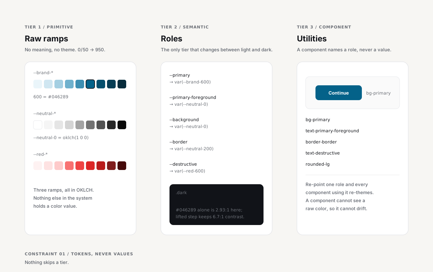
Research-backed patterns create new AI experiences and scale content across conversations, agent workflows, and review.
Here are the key findings.
Prompts, responses, and supporting context.
Steps, tool activity, and visible progress.
Check the result before moving forward.
Human decision pointClear checkpoints, feedback, and decisions.
Illustrative compositions showing how the system supports AI application patterns.
Clear usage guidance helps teams and agents apply components consistently across products.
See the real component and its source together.
Inspect rendered dimensions, spacing, and resolved tokens.
Bring editable component source into the project.
Follow documented composition patterns and guidelines.
bg-primary text-primary-foregroundThe component follows the theme and stays connected to the system.
background: #046289A value embedded in a component bypasses the semantic role and needs review.
MCP or API access makes the rules available in the development workflow. The design agent and testing agent use that context at different stages.
Make framework context, component guidance, and design rules available through MCP or API.
The shadcn design agent uses that context to create and compose the interface.
The UI testing agent checks the resulting UI code against the shared rules.
Developers address findings, then run another review as the product evolves.
The UI testing agent reviews the implementation against the shared system, checking design tokens, component architecture, and documented usage patterns. When it finds a discrepancy, it explains the issue and generates a Jira-ready story so the team can prioritize, fix, and verify the change.
Read the UI code and identify the components, tokens, and patterns in use.
Compare the implementation with the shared token architecture and usage rules.
Describe what is out of alignment, where it occurs, and which rule is affected.
Turn each finding into a Jira-ready story with a clear fix and acceptance criteria.
The goal is consistent development: shared decisions before implementation, useful checks afterward, and people in control of the final result.